一款css实现的鼠标经过按钮的特效
2014/9/30 11:25:07来源:三联
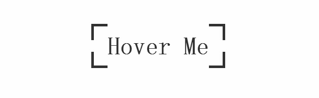
今天要为各网友再带来一款css实现的鼠标经过按钮的特效。按钮初始时,边框为断开的按钮,当鼠标经过按钮时动画变为封闭的边框。效果图如下:
我们一起看下实现的代码:
html代码:
代码如下:
<body>
<a target="_blank" class="btn-edge" href=http://www.jb51.net>Hover Me</a>
</body>
css代码:
代码如下:
*, *:before, *:after
{
margin: 0;
padding: 0;
-webkit-box-sizing: border-box;
-moz-box-sizing: border-box;
box-sizing: border-box;
}
body
{
padding-top: 10%;
text-align: center;
overflow-x: hidden;
}
.btn-edge
{
position: relative;
display: inline-block;
padding: 1rem 2rem;
font-family: 'Titillium Web' , sans-serif;
font-weight: 700;
text-decoration: none;
font-size: 3rem;
color: #333;
background-image: -webkit-gradient(linear, left top, left bottom, from(#333), to(#333)), -webkit-gradient(linear, left top, left bottom, from(#333), to(#333)), -webkit-gradient(linear, left top, left bottom, from(#333), to(#333)), -webkit-gradient(linear, left top, left bottom, from(#333), to(#333)), -webkit-gradient(linear, left top, left bottom, from(#333), to(#333)), -webkit-gradient(linear, left top, left bottom, from(#333), to(#333)), -webkit-gradient(linear, left top, left bottom, from(#333), to(#333)), -webkit-gradient(linear, left top, left bottom, from(#333), to(#333));
background-image: -webkit-linear-gradient(#333, #333), -webkit-linear-gradient(#333, #333), -webkit-linear-gradient(#333, #333), -webkit-linear-gradient(#333, #333), -webkit-linear-gradient(#333, #333), -webkit-linear-gradient(#333, #333), -webkit-linear-gradient(#333, #333), -webkit-linear-gradient(#333, #333);
background-image: linear-gradient(#333, #333), linear-gradient(#333, #333), linear-gradient(#333, #333), linear-gradient(#333, #333), linear-gradient(#333, #333), linear-gradient(#333, #333), linear-gradient(#333, #333), linear-gradient(#333, #333);
background-repeat: no-repeat;
-webkit-background-size: 2rem 5px, 2rem 5px, 2rem 5px, 2rem 5px, 5px 2rem, 5px 2rem, 5px 2rem, 5px 2rem;
background-size: 2rem 5px, 2rem 5px, 2rem 5px, 2rem 5px, 5px 2rem, 5px 2rem, 5px 2rem, 5px 2rem;
background-position: 0 0, 100% 0, 0 100%, 100% 100%;
-webkit-box-shadow: inset 0 0 0 5px rgba(255, 99, 71, 0);
box-shadow: inset 0 0 0 5px rgba(255, 99, 71, 0);
-webkit-transition: background-size 1s .4s, -webkit-box-shadow .4s, color .4s;
transition: background-size 1s .4s, box-shadow .4s, color .4s;
-webkit-transform: translateZ(0);
transform: translateZ(0);
}
.btn-edge:hover
{
color: tomato;
-webkit-background-size: 100% 5px, 100% 5px, 100% 5px, 100% 5px, 5px 100%, 5px 100%, 5px 100%, 5px 100%;
background-size: 100% 5px, 100% 5px, 100% 5px, 100% 5px, 5px 100%, 5px 100%, 5px 100%, 5px 100%;
-webkit-box-shadow: inset 0 0 0 5px tomato;
box-shadow: inset 0 0 0 5px tomato;
-webkit-transition: background-size 1s, -webkit-box-shadow .4s .6s, color .4s .6s;
transition: background-size 1s, box-shadow .4s .6s, color .4s .6s;
}
免责声明:本站文章系图趣网整理发布,如需转载,请注明出处,素材资料仅供个人学习与参考,请勿用于商业用途!
本文地址:http://www.tuquu.com/tutorial/wd2221.html
本文地址:http://www.tuquu.com/tutorial/wd2221.html
这些是最新的
最热门的教程